Advanced SmartGWT Tutorial, Part 2
This is the second part of my tutorial regarding rapid UI development with SmartGWT. In the first part of the tutorial, we created the basic interface layout and added some basic components. It is now time to take it up a notch and use the real power of SmartGWT.
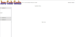
Before we proceed, let’s remember how the UI we have created so far looks like:
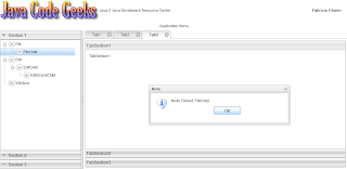
After we have completed this tutorial, here is what the UI will have transformed into:
We will have to revisit some of the existing classes in order to define additional functionally to them. Let’s start with the NavigationArea class. There we used the SectionStack class for the creation of an accordion. However, each of the stack sections contained just a plain label. We are going to add something more useful, navigation wise. We will use a tree for the navigation pane, where each leaf will essentially represent an action. For this, we are going to extend the TreeGrid class by defining specific characteristics to out implementation. Hence, here is the “NavigationTreeGrid” class:
01 02 03 04 05 06 07 08 09 10 11 12 13 14 15 16 17 18 19 20 21 22 23 24 25 26 27 28 29 30 31 32 33 34 35 36 37 38 39 40 41 42 43 44 45 46 47 48 49 50 51 52 53 54 | package com.javacodegeeks.smartgwt.appui.client.ui.widgets;import com.smartgwt.client.types.SelectionStyle;import com.smartgwt.client.types.TreeModelType;import com.smartgwt.client.util.SC;import com.smartgwt.client.widgets.tree.Tree;import com.smartgwt.client.widgets.tree.TreeGrid;import com.smartgwt.client.widgets.tree.TreeNode;import com.smartgwt.client.widgets.tree.events.NodeClickEvent;import com.smartgwt.client.widgets.tree.events.NodeClickHandler;public class NavigationTreeGrid extends TreeGrid { public NavigationTreeGrid() { setNodeIcon("arrow_down.png"); setFolderIcon("arrow_up.png"); setShowOpenIcons(false); setShowDropIcons(false); setShowSelectedStyle(true); setShowPartialSelection(true); setCascadeSelection(false); setCanSort(false); setShowConnectors(true); setShowHeader(false); setLoadDataOnDemand(false); setSelectionType(SelectionStyle.SINGLE); Tree data = new Tree(); data.setModelType(TreeModelType.CHILDREN); data.setRoot( new TreeNode("root", new TreeNode("File", new TreeNode("FileChild")), new TreeNode("Edit", new TreeNode("EditChild", new TreeNode("EditGrandChild"))), new TreeNode("Window")) ); setData(data); addNodeClickHandler(new NodeClickHandler() { @Override public void onNodeClick(NodeClickEvent event) { String name = event.getNode().getName(); SC.say("Node Clicked: " + name); } }); }} |
We first define some attributes for our tree, the more important being:
- setShowConnectors: Defines whether connector lines should be shown, illustrating the tree’s hierarchy.
- setClosedIconSuffix: This suffix is appended to the provided icon name and defaults to “closed”, so you should better use a custom value and override that.
- setSelectionType: Defines a grid’s clickable-selection behavior, i.e. whether multiple items can be selected at a given time.
Additionally, the setNodeIcon and setFolderIcon methods are used for setting the appropriate icon to each node, depending on whether it is a parent or leaf node.
Next we create a Tree instance, which is essentially a data model that represents a set of objects linked into a hierarchy. Each tree node is implemented via the TreeNode class and we set the root node by using the setRoot method. Note that each node can be constructed by using a name and an array of objects, thus by adopting a recursive approach we can create the whole tree in one line. Then, we feed the TreeGrid with the data from our Tree using the setData method. Finally, we register a handler for the node click events and implement the NodeClickHandler interface by creating a pop-up window showing the name of the node.
In order to use our newly created tree, we return to our “NavigationArea” class and change the following lines:
1 2 3 4 5 6 7 | ...SectionStackSection section1 = new SectionStackSection("Section 1");section1.setExpanded(true);final NavigationTreeGrid navigationTreeGrid = new NavigationTreeGrid();navigationTreeGrid.setHeight100();section1.addItem(navigationTreeGrid);... |
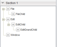
Let’s see how this is changes our interface in the navigation area:
When one of the nodes is clicked, a window with the relevant name appears:
The next step is to populate the main area which is now pretty much empty. We are going to use tabs for that purpose. The use of tabs is highly preferred since it is very efficient regarding the screen real-estate. By stacking tabs, the user can simultaneously have a lot of panels open and navigate to the preferred one just by clicking on it.
In SmartGWT, the use of tabs is accommodated by the Tab class. In order to render tabs however, those must be grouped in a TabSet, which allows components on several panes to share the same space. The tabs at the top can be selected by the user to show each pane.
We are now going to revisit the “MainArea” class and add three different tab panes in it. The first one will just hold arbitrary HTML elements, the second will have a menu attached to it and the third will hold a custom vertical accordion. Let’s see how this is done:
01 02 03 04 05 06 07 08 09 10 11 12 13 14 15 16 17 18 19 20 21 22 23 24 25 26 27 28 29 30 31 32 33 34 35 36 37 38 39 40 41 42 43 44 45 46 47 48 49 50 51 52 53 54 55 56 57 58 59 60 61 62 63 64 65 66 67 68 69 70 71 72 73 74 75 76 77 78 79 80 81 | package com.javacodegeeks.smartgwt.appui.client.ui;import com.javacodegeeks.smartgwt.appui.client.ui.widgets.CustomAccordion;import com.smartgwt.client.types.Overflow;import com.smartgwt.client.types.Side;import com.smartgwt.client.widgets.Canvas;import com.smartgwt.client.widgets.HTMLFlow;import com.smartgwt.client.widgets.layout.VLayout;import com.smartgwt.client.widgets.menu.Menu;import com.smartgwt.client.widgets.menu.MenuItem;import com.smartgwt.client.widgets.tab.Tab;import com.smartgwt.client.widgets.tab.TabSet;import com.smartgwt.client.widgets.toolbar.ToolStrip;import com.smartgwt.client.widgets.toolbar.ToolStripButton;import com.smartgwt.client.widgets.toolbar.ToolStripMenuButton;public class MainArea extends VLayout { final TabSet topTabSet = new TabSet(); public MainArea() { super(); this.setOverflow(Overflow.HIDDEN); topTabSet.setTabBarPosition(Side.TOP); topTabSet.setTabBarAlign(Side.LEFT); ToolStrip toolStrip = new ToolStrip(); toolStrip.setWidth100(); ToolStripButton iconButton = new ToolStripButton(); iconButton.setTitle("MyButton"); toolStrip.addButton(iconButton); MenuItem[] itemArray = new MenuItem[4]; itemArray[0] = new MenuItem("MenuItem1"); Menu menu1 = new Menu(); menu1.setData(new MenuItem("SubMenuItem11"), new MenuItem("SubMenuItem12")); itemArray[0].setSubmenu(menu1); itemArray[1] = new MenuItem("MenuItem2"); Menu menu2 = new Menu(); menu2.setData(new MenuItem("SubMenuItem21"), new MenuItem("SubMenuItem22")); itemArray[1].setSubmenu(menu2); Menu parentMenu = new Menu(); parentMenu.setCanSelectParentItems(true); parentMenu.setData(itemArray); ToolStripMenuButton menuButton = new ToolStripMenuButton("Menu", parentMenu); toolStrip.addMenuButton(menuButton); VLayout hlayout = new VLayout(); hlayout.addMember(toolStrip); hlayout.addMember(new HTMLFlow("Tab3")); addTabToTopTabset("Tab1", new HTMLFlow("Tab1"), true); addTabToTopTabset("Tab2", hlayout, true); addTabToTopTabset("Tab3", new CustomAccordion(), true); this.addMember(topTabSet); } private void addTabToTopTabset(String title, Canvas pane, boolean closable) { Tab tab = createTab(title, pane, closable); topTabSet.addTab(tab); topTabSet.selectTab(tab); } private Tab createTab(String title, Canvas pane, boolean closable) { Tab tab = new Tab(title); tab.setCanClose(closable); tab.setPane(pane); return tab; } } |
Things to note here. First, we use a ToolStrip, which is actually a strip to which various widgets (buttons, menus etc.) can be attached. Specific classes can only be added to a tool strip. For example, if you want to add a button, you have to create a ToolStripButton instance. Similarly, a whole Menu can be attached to it. After we create an instance of the menu class, we use the MenuItem class to add components to it. Finally, the menu is encapsulated to a ToolStripMenuButton and then it is finally added to the tool strip.
Regarding tabs, the API is very simple. We use the addTab method of the TabSet class to add new tabs and the selectTab method in order to select a specific tab. On the tab itself, we can use the setPane method to specify the pane associated with the specific tab. To determine whether the tab should provide an icon for closing itself, the setCanClose method is used.
Finally, lets see the “CustomAccordion” class which is basically a vertical accordion.
01 02 03 04 05 06 07 08 09 10 11 12 13 14 15 16 17 18 19 20 21 22 23 24 25 26 27 28 29 30 31 32 33 34 35 36 37 38 39 40 41 42 43 44 45 46 47 48 | package com.javacodegeeks.smartgwt.appui.client.ui.widgets;import com.smartgwt.client.types.Overflow;import com.smartgwt.client.types.VisibilityMode;import com.smartgwt.client.widgets.HTMLFlow;import com.smartgwt.client.widgets.layout.SectionStack;import com.smartgwt.client.widgets.layout.SectionStackSection;public class CustomAccordion extends SectionStack { public CustomAccordion() { this.setWidth100(); this.setVisibilityMode(VisibilityMode.MUTEX); this.setShowExpandControls(false); this.setAnimateSections(true); SectionStackSection section1 = new SectionStackSection("TabSection1"); section1.setExpanded(true); HTMLFlow htmlFlow1 = new HTMLFlow(); htmlFlow1.setOverflow(Overflow.AUTO); htmlFlow1.setPadding(10); htmlFlow1.setContents("TabSection1"); section1.addItem(htmlFlow1); SectionStackSection section2 = new SectionStackSection("TabSection2"); section2.setExpanded(false); HTMLFlow htmlFlow2 = new HTMLFlow(); htmlFlow2.setOverflow(Overflow.AUTO); htmlFlow2.setPadding(10); htmlFlow2.setContents("TabSection2"); section2.addItem(htmlFlow2); SectionStackSection section3 = new SectionStackSection("TabSection3"); section3.setExpanded(false); HTMLFlow htmlFlow3 = new HTMLFlow(); htmlFlow3.setOverflow(Overflow.AUTO); htmlFlow3.setPadding(10); htmlFlow3.setContents("TabSection3"); section3.addItem(htmlFlow3); this.addSection(section1); this.addSection(section2); this.addSection(section3); }} |
Nothing we haven’t seen before, we use the SectionStack class to create the accordion and add SectionStackSections to it. The HTMLFlow class is used for displaying HTML content that should expand to its natural size without scrolling.
Launch the Eclipse configuration and point the browser to the provided URL:
http://127.0.0.1:8888/AwesomeSmartGWTUIProject.html?gwt.codesvr=127.0.0.1:9997
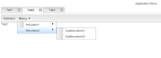
Let’s now see how each of the tab looks like:
* Tab1: Very plain and simple.
* Tab2: This tab contains a tool strip with a button and a menu attached to it.
*Tab3: This tab encloses a vertical accordion with three separate sections.
And this is what the whole user interface looks like:
We have come to the end of this tutorial, so let’s revisit what we have done. First, we created the main layout of the UI by defining specific areas and adding the corresponding sub-layouts. Each sub-layout was processed separately. For the header area, we added the application’s logo on the left side and the logged in user’s name on the right. For the navigation area, we used an accordion which enclosed a tree in one of its sections. The tree can have an arbitrary number of children, grandchildren etc., but you should not go overboard with it. Finally, for the main layout, we used tabs in order to exploit the screen area to its fullest. Three predefined tabs were created, each one containing various widgets. Note that the navigation pane should be linked to the main area. This can be accomplished by creating a new tab whenever the user clicks on one of the tree leafs.
That’s all guys. You can find here the final Eclipse project created. If you enjoyed this, don’t forget to share! Cheers!
- Advanced SmartGWT Tutorial, Part 1
- Getting Started with SmartGWT for awesome GWT interfaces
- Add JSON capabilities into your GWT application
- Building your own GWT Spring Maven Archetype
- Adding CAPTCHA to your GWT application
- GWT Spring and Hibernate enter the world of Data Grids


Hi can any one tell me how to create a tab by clicking node in the tree grid.
Hi,
Both the links to the project downloads for Part 1 & 2 tutorials to dropbox are bad, can you fix the links to the new locations.
Thanks
Martin