Desktop Java
JavaFX 2.0 Layout Panes – HBox and VBox
If you want an overview on all different layout panes in JavaFX 2.0 or if you want to know yome basic facts about them, please see my previous post Layout Panes in JavaFX 2.0.
The layout panes
HBox and VBox are definitely the most basic layout containers in JavaFX 2.0. As you can already tell by their name, their purpose is to layout all their children in one horizontal row (HBox) or in one vertical column (VBox). Because they´re very easy to use and very useful regarding minor layout issues, you´ll probably use them a lot. I´ll give two examples on how you can use them. As in the other examples, first of all the code and afterwards the explanations.HBox and VBox – Example 1
import javafx.application.Application;
import javafx.geometry.Pos;
import javafx.scene.Scene;
import javafx.scene.control.Button;
import javafx.scene.layout.HBox;
import javafx.scene.layout.VBox;
import javafx.stage.Stage;

/**
 *
 * Created on: 20.03.2012
 * @author Sebastian Damm
 */
public class HBoxandVBoxExample extends Application
{
    @Override
    public void start(Stage primaryStage) throws Exception
    {
        HBox hbox = new HBox(50);
        hbox.setAlignment(Pos.CENTER); // default TOP_LEFT

        VBox vbox1 = new VBox();
        vbox1.setAlignment(Pos.BOTTOM_CENTER);
        vbox1.setStyle("-fx-border-style: solid;"
                + "-fx-border-width: 1;"
                + "-fx-border-color: black");

        VBox vbox2 = new VBox(10);
        vbox2.setAlignment(Pos.CENTER);
        vbox2.setStyle("-fx-border-style: solid;"
                + "-fx-border-width: 1;"
                + "-fx-border-color: black");

        VBox vbox3 = new VBox(20);
        vbox3.setAlignment(Pos.TOP_CENTER);
        vbox3.setStyle("-fx-border-style: solid;"
                + "-fx-border-width: 1;"
                + "-fx-border-color: black");

        for (int i = 0; i < 5; i++)
        {
            Button bt = new Button("Button " + (i+1));
            Button bt2 = new Button("Button " + (i+1)); // unfortunately there´s no "clone" or "copy" method
            Button bt3 = new Button("Button " + (i+1));

            vbox1.getChildren().add(bt);
            vbox2.getChildren().add(bt2);
            vbox3.getChildren().add(bt3);
        }

        hbox.getChildren().addAll(vbox1, vbox2, vbox3);
        Scene scene = new Scene(hbox, 350, 250); // the hbox is the root node

        primaryStage.setTitle("HBox and VBox Example");
        primaryStage.setScene(scene);
        primaryStage.show();
    }

    public static void main(String[] args)
    {
        Application.launch(args);
    }
}
Basically we create three different VBoxes and put them into one HBox. In both classes you can define a spacing value either directly in the constructor or via the
setSpacing method. This value will be used as the gap between the individual children in the pane. The line HBox hbox = new HBox(50); therefore creates a HBox to hold three VBoxes with a gap of 50 pixel between each of them.We use the
setAlignment method to specify, how the individual VBoxes should arrange and layout all their childen.With
setStyle you can apply custom CSS styles to any Node. I don´t want to go into much detail yet, because I´ll cover CSS styles in JavaFX 2.0 in one of my next posts, but if you´re already familiar with CSS you´ll probably already have noticed that the JavaFX 2.0 team fortunately decided to follow the CSS standards defined by W3C (http://www.w3.org) very closely. If you´re not familiar with CSS you just need to know that theses lines of CSS create a 1px wide black border around the component. I use them here to show you the size of the individual VBoxes.The next few lines should be pretty ordinary for you by now: We create five buttons for each VBox, put the different VBoxes into our HBox, declare a
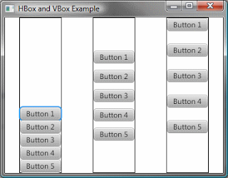
Scene object (with the HBox as root) and show our application. Your application should look like this now:
You can see that each
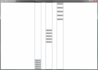
VBox lays out their children buttons with the defined spacing value and that the HBox lays out the three VBoxes with a gap of 50 pixels. Because we set a different alignment for each VBox you can see that that they arrange the buttons inside their bounds in a specific way. Note: We also specified a alignment for the
HBox, otherwise the three VBoxes would not have been layed out in the center! If you resize the window of your application it should look like this:
You can see that the VBoxes grow and fill the space provided by their parent and that they still arrange their children according to their set alignment.
HBox and VBox – Example 2
The next example will show how to use the static
setMargin and setHgrow (respectively setVgrow) methods:import javafx.application.Application;
import javafx.geometry.Insets;
import javafx.scene.Scene;
import javafx.scene.control.*;
import javafx.scene.layout.*;
import javafx.stage.Stage;
/**
*
* Created on: 20.03.2012
* @author Sebastian Damm
*/
public class HBoxandVBoxExample2 extends Application
{
@Override
public void start(Stage primaryStage) throws Exception
{
StackPane root = new StackPane();
HBox hbox = new HBox(30); // create a HBox to hold 2 vboxes
// create a vbox with a textarea that grows vertically
VBox vbox = new VBox(10);
Label lbName = new Label("I´m a label!");
TextField textField = new TextField();
TextArea textArea = new TextArea();
textArea.setPrefWidth(100);
VBox.setVgrow(textArea, Priority.ALWAYS);
vbox.getChildren().addAll(lbName, textField, textArea);
// create a vbox that grows horizontally inside the hbox
VBox vbox2 = new VBox(10);
Label lbName2 = new Label("I´m also a label!");
TextField tf2 = new TextField();
tf2.setPromptText("type here");
TextArea textArea2 = new TextArea();
textArea2.setPrefWidth(100);
vbox2.getChildren().addAll(lbName2, tf2, textArea2);
HBox.setHgrow(vbox2, Priority.ALWAYS);
// the next two lines behave equally - try to comment the first line out and use the 2nd line
hbox.setPadding(new Insets(20));
// StackPane.setMargin(hbox, new Insets(20));
hbox.getChildren().addAll(vbox, vbox2);
root.getChildren().add(hbox);
Scene scene = new Scene(root, 500, 300); // the stack pane is the root node
primaryStage.setTitle("HBox and VBox Example 2");
primaryStage.setScene(scene);
primaryStage.show();
}
public static void main(String[] args)
{
Application.launch(args);
}
}In this example we create two VBoxes that are children of a HBox. Inside the VBoxes there are one label, one textfield and one textarea.
The first remarkable line is
VBox.setVgrow(textArea, Priority.ALWAYS). With this line we define, that the TextArea object should always grow vertically if it is contained by a VBox (otherwise there won´t be any effects). Next, put a focus on HBox.setHgrow(vbox2, Priority.ALWAYS). Here we tell the second VBox to grow horizontally inside the HBox.Finally with
hbox.setPadding(new Insets(20)); or StackPane.setMargin(hbox, new Insets(20)) we give the whole HBox some padding. The two lines behave equally here because on the one side we specify a padding for the pane itself that should be used by the pane inside its bounds to layout its children and on the other side we tell the parent to lay out the pane with the given margin around it.Note: Margin is the outer distance/gap, padding the inner one.
Here is a picture showing you the ‘CSS Box Model’ that demonstrates the relation between the content, the padding, the border, and the margin of an element.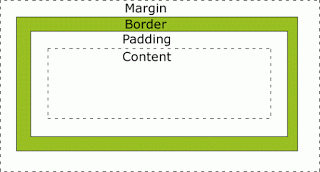
Because the
setPadding method is defined in the Region class, every layout pane can use this method. The Insets class is used a lot for those purposes and provides two different constructors: One that takes one double value and defines the same padding for each side and one constructor that takes four double values and defines the padding clockwise from the top to the left side.Hint: If you apply a border to the
HBox and switch between the two lines for setting padding/margin, you will see the difference more clearly.Your application should look like this:
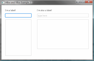
Note the 10px padding around the HBox. If you now resize you window it should look similar to this:
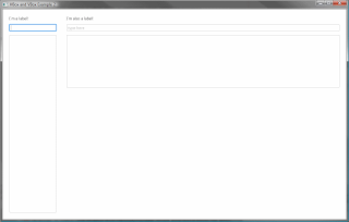
As you can see the TextArea in the left VBox grows vertically and the whole right VBox grows horizontally inside the HBox.
Reference: JavaFX 2.0 Layout Panes – HBox and VBox from our JCG partner Sebastian Damm at the Just my 2 cents about Java blog.



Hi there,
please re-up your images!
thank you!