ZK in Action: Styling and Layout
In this post, we’ll go over how to append new CSS styling rules onto ZK widgets and how to override the existing styling. We’ll also introduce some basics of UI layout in ZK.
Objective
- Use ZK’s layout and container widgets to host the inventory CRUD feature we built in the previous posts.
- Style the ZK widgets
ZK Features in Action
- Borderlayout
- Hlayout
- Tabbox
- Include
- sclass
- zclass
Using Layouts and Containers The Borderlayout and Hlayout
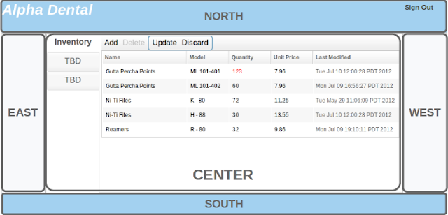
The Borderlayout divides the window into 5 sections as shown below:

Without further ado let’s dissect the markup and see how it works:
01 02 03 04 05 06 07 08 09 10 11 12 13 14 15 16 17 18 19 20 21 22 23 24 25 26 27 28 | <window ...'> <borderlayout width='100%' height='100%'> <north size='15%'> <hlayout width='100%' height='100%'> <label hflex='9' value='Alpha Dental' /> <label hflex='1' value='Sign Out' ></label> </hlayout> </north> <east size='10%'></east> <center> <tabbox width='100%' height='100%' orient='vertical'> <tabs width='15%'> <tab label='Inventory' /> <tab label='TBD' /> <tab label='TBD'/> </tabs> <tabpanels> <tabpanel> <include src='inventory.zul'/> </tabpanel> <tabpanel></tabpanel> <tabpanel></tabpanel> </tabpanels> </tabbox> </center> <west size='10%' ></west> <south size='10%'></south> </borderlayout> |
- line 3 and 27, the north and south widgets can be adjusted for height but not width
- line 9 and 26, the east and west widgets can be adjusted for width but not height
- line 10, the center widget’s dimensions are dependent on those entered for the north, west, south, and east widgets
- from line 4 through 7, we wrap the two labels with an Hlayout so they’ll be displayed side by side proportionally with respect to the ‘hflex’ attribute we specified. That is, the Label assigned with hflex=’9′ has 9 times the width of the Label assigned with hflex=’1′.
- each inner widget (north, west, etc.) can accept only a single child component, hence, multiple widgets must be wrapped by a single container widget such as Hlayout before placed inside the Borderlayout inner widgets (north, west, etc.)
- line 11, we place a Tabbox element and set its orientation as vertical in anticipation of embedding our inventory CRUD feature inside it
- line 12 to 16, we put the heading for each tab
- line 18, a Tabpanel is a container that holds a tab’s content
- line 19, we embed our inventory CRUD feature inside an Include tag. The widgets on inventory.zul will be attached to this page
Overriding the Existing ZK Styling Rules
The ZK default font properties and the background colours were modified so headings would be presented more prominently. Let’s quickly explain how this is accomplished.
Using Chrome Developer Tool or the Firebug extension, we could easily inspect the source of our Borderlayout and find the ZK styling class for the ZK widgets as shown below:
 From here we learned that the naming pattern for the highlighted region is z-north-body. Similarly, we could do the same for all the markup of interest and go ahead overriding their CSS styling rules:
01 02 03 04 05 06 07 08 09 10 11 12 13 14 15 16 | <zk><style> .z-tab-ver .z-tab-ver-text { font-size: 18px; } .z-north-body, .z-south-body { background:#A3D1F0 } .z-east-body, .z-west-body { background:#F8F9FB }</style><window border='none' width='100%' height='100%'> <borderlayout width='100%' height='100%'> <north size='15%'>...</north> <east size='10%'></east> <center>...</center> <west size='10%'></west> <south size='10%'></south> </borderlayout></window></zk> |
Appending Additional Styling Rules via Style Attribute
Here we’re modifying the styling of the Labels contained in the North widget. Since we only want these two Labels, not all of them, to be affected by our new styling, it does not make sense for us to override the original styling as we did before. For these isolated modifications, it suffice to simply assign the styling rules to the ‘style’ attribute that comes with the ZK widgets:
1 2 3 4 5 6 | <north size='15%'> <hlayout width='100%' height='100%'> <label value='Alpha Dental' style='font-size: 32px; font-style: italic; font-weight:bold; color:white; margin-left:8px;'/> <label value='Sign Out' style='font-size: 14px; font-weight:bold; color:grey; line-height:26px'></label> </hlayout></north>... |
Appending Additional Styling Rules via Sclass
An alternative to assign styling rules directly in the markup and pollute the code is to declare a styling class, abbreviated as ‘sclass’, and assign the rules to the ‘sclass’ attribute as shown here:
01 02 03 04 05 06 07 08 09 10 11 12 13 14 15 16 17 | <zk><style> .company-heading { font-size: 32px; font-style: italic; font-weight:bold; color:white; margin-left:8px; }</style><window ...> <borderlayout ...> <north ...> <label value='Alpha Dental' sclass='company-heading'/></north> ... </borderlayout></window></zk> |
In a Nutshell
- Three ways to modify the default ZK styling is covered in this post: override the existing ZK styling class, assign styling rules directly to a widget’s style attribute, or define a CSS class in a CSS file or inside a Style tag then assign the class to the widget’s sclass attribute
- Use a developer tool(such as Firebug) to inspect the ZK widgets and find out which ZK style class to override
- The hlex attribute allows developers to define widgets’ width proportionally with respect to each other
- Layout widgets help developers to divide the presentation window into sections
Related links:
ZK Styling Guide
Borderlayout
Hlayout
Hflex
Reference: ZK in Action [4] : Styling and Layout from our JCG partner Lance Lu at the Tech Dojo blog.


