JavaFX Tip 6: Use Transparent Colors
Picking the right colors for your user interface elements is always a great challenge, but it is even more challenging when you develop reusable framework controls where you as a developer have no control over the look and feel of the application using them. While you might always add elements on top of the default gray background the developers embedding your controls might have more of a gothic tendency and use a black background. All of a sudden the nice colors your picked clash with the rest of the application.
To tackle this problem the best way I found while working on FlexGanttFX and FlexCalendarFX was to use semi-transparent colors. When you do the color of your UI elements will always be a mix of their own color and the background color. Your colors will become brighter if the application uses a white background and darker if it is using a black background. The contrast between your element and the background will never be strong, which makes for a smooth appearance.
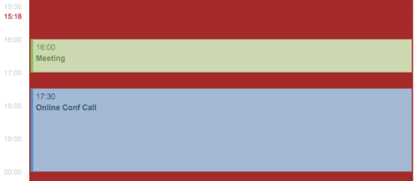
The following screenshots were taken from FlexCalendarFX (work-in-progress).
Same UI now with a darker background. You might not see it at first, but the green and blue are actually different between these two screenshots. These are very subtle differences, but they make a big difference in the overall impression of your application.
In JavaFX you can define colors in CSS with an alpha channel value smaller than 1 to achieve transparency:
.my-style {
    -fx-background-color: rgba(255, 255, 255, .7); // transparent white
}
Using opacity also has the nice side-effect that you can still distinguish different elements even when they overlap each other.
| Reference: | JavaFX Tip 6: Use Transparent Colors from our JCG partner Dirk Lemmermann at the Pixel Perfect blog. |


