Android UI Overview
This article is part of our Academy Course titled Android UI Design – Basics.
In this course, you will get a look at the fundamentals of Android UI design. You will understand user input, views and layouts, as well as adapters and fragments. Check it out here!
Table Of Contents
1. Introduction
Android is a widely used OS made for smart phones and tablets. It is an open source project led by Google and it is released under Apache License. This permissive license helped this OS to be widely adopted and allows the manufacturers to freely modify and customize it. As matter of fact, despite Android being designed for smartphones and tablets, it is also used in TVs, cameras and so on. Moreover, Android has a very large community that extend its features and creates apps that cover almost all aspects.
All android applications, called apps, are built on Android UI framework. App interface is the first thing a user sees and interacts with. From the user perspective, this framework keeps the overall experience consistent for every app installed in our smartphone or tablets. At the same time, from the developer perspective, this framework provides some basic blocks that can be used to build complex and consistent user interface (API).
Android UI interface is divided in three different areas:
- Home screen
- All apps
- Recent screen
The home screen is the “landing” area when we power our phone on. This interface is highly customizable and themed. Using widgets we can create and personalize our “home” screen. All apps is the interface where the app installed are displayed, while recent screens are the list of last used apps.
Since its born, Android has changed a lot in terms of its features and its interfaces. The growth of the smartphone power made possible creating ever more appealing apps.
At the beginning, apps in Android did not have a consistent interface and well defined rules so every app had a different approach, navigation structure and buttons position. This caused user confusion and it was one of the most important missing features compared to the iOS.
2. Android App Structure and UI patterns
Android apps are very different from each other because they try to address different user needs. There are simple apps with a very simple UI that has just only one view and there are other apps much more complex with a very structured navigation and multiple views.
In general, we can say an Android app is made by a top-level view and detail/level view.
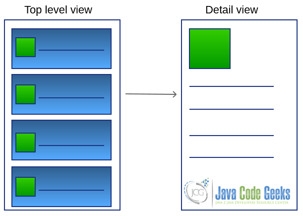
One of the biggest efforts made by Google was to define a well defined set of rules that helps developers to create appealing user interfaces. At the same time, these rules help users to navigate through every app in the same way. We call this UI consistency. Android, moreover, guarantees to the developers the required flexibility to customize the app look and feel and make it unique. These rules are known as UI patterns. Patterns are proven solution approaches to well known problems. Thus, having a well defined UI pattern catalog and knowing when and where apply them, we can create appealing apps that are not only full of interesting features but they are enjoyable by users and easy to use.
2.1. Top level view
As said, the top level view is the “landing” area of our app, so we have to reserve to it a special attention, because this is the first thing an user sees of our app. There are some specific patterns that can be applied when designing this view depending on the type of information we want to show:
- Fixed tabs
- Spinner
- Navigation drawer
We have to choose one of them carefully depending on the nature of our app. We can use fixed tabs when we want to give to the user an overview of the different views present in our app, so that a user can switch easily between them to show different type of information. A typical example is a app that shows tech news: in this case we could use different tabs to group news like (‘Android’,’iOS’, ‘Games’ and so on).
Spinner is used when we want to move directly to a specific view, this is the case of a calendar app when we can use spinner to go directly to a specific month.
The navigation drawer is one of the newest patterns introduced by Google. This is a sliding menu, usually at the left side of the smartphone screen, that can be opened and closed by the user. This pattern can be used when we have a multiple top level view and we want to give to the user a fast access to one of them, or we want to give to the user the freedom to move to one low level view directly. This pattern replaces, somehow, an old pattern called dashboard widely used in the past. This pattern is simple a view where there are some big buttons/icons to access to specific views/app features.
2.2. Detail view
The detail view is a low level view where a user can interact with data directly. It is used to show data and edit them. In this kind of view the layout plays an important role to make data well organized and structured. At this level, we can implement an efficient navigation to improve usability of our app. In fact, we can use swipe view pattern so that user can move between different detail views. Depending on the type of component we use to show detail information to the user, we can implement some low level patterns that simplify the user interaction with our app.
2.3. Action Bar
The action bar is relatively new in Android and was introduced in Android 3.0 (API level 11). It is a well known pattern that plays an important role. An action bar is a piece of the screen, usually at the top, that is persistent across multiple views. It provides some key functions:
- App branding: icon area
- Title area
- Key action area
- Menu area
3. Standard components
How do we build an user interface? Android gives some key components that can be used to create user interface that follows the pattern we talked about before. All the Android user interface are built using these key components:
View: It is the base class for all visual components (control and widgets). All the controls present in an android app are derived from this class. AViewis an object that draws something on a smartphone screen and enables an user to interact with it.Viewgroup: AViewGroupcan contain one or moreViewsand defines how theseViewsare placed in the user interface (these are used along with Android Layout managers.Fragments: Introduced from API level 11, this component encapsulates a single piece of UI interface. They are very useful when we have to create and optimize our app user interface for multiple devices or multiple screen size.Activities: Usually an Android app consists of several activities that exchange data and information. AnActivitytakes care of creating the user interface.
Moreover, Android provides several standard UI controls, Layout managers and widgets that we can use without much effort and with which we can create apps fast and simply.
Furthermore, we can can extend them and create a custom control with a custom layout and behaviour. Using these four components and following the standard UI patterns we can create amazing apps that are “easy-to-use”. There are some other aspects, anyway, we have to consider when building and coding an app, like themes, styles, images and so on, and those will be covered in the following articles.
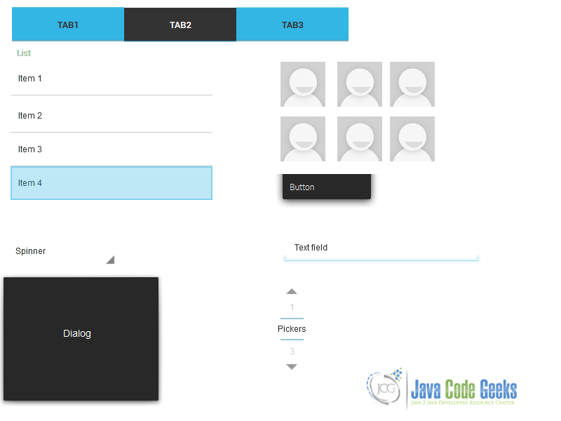
As said, Android provides some standard UI components that can be grouped in:
- Tabs
- Spinners
- Pickers
- Lists
- Buttons
- Dialogs
- Grid lists
- TextFields
The figure below shows some Android custom components:
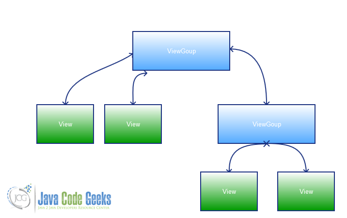
If we analyze in more detail an Android user interface, we can notice that it has an hierarchical structure where at the root there’s a ViewGroup. A ViewGroup behaves like an invisible container where single views are placed following some rules. We can combine ViewGroup with ViewGroup to have more control on how views are located. We have to remember that more complex is the user interface more time the system requires to render it. Therefore, for better performance we should create simple UIs. Additionally, a clean interface helps user to have a better experience when using our app.
A typical UI structure is shown below:
If we create a simple android app, using our IDE, we can verify the UI structure:
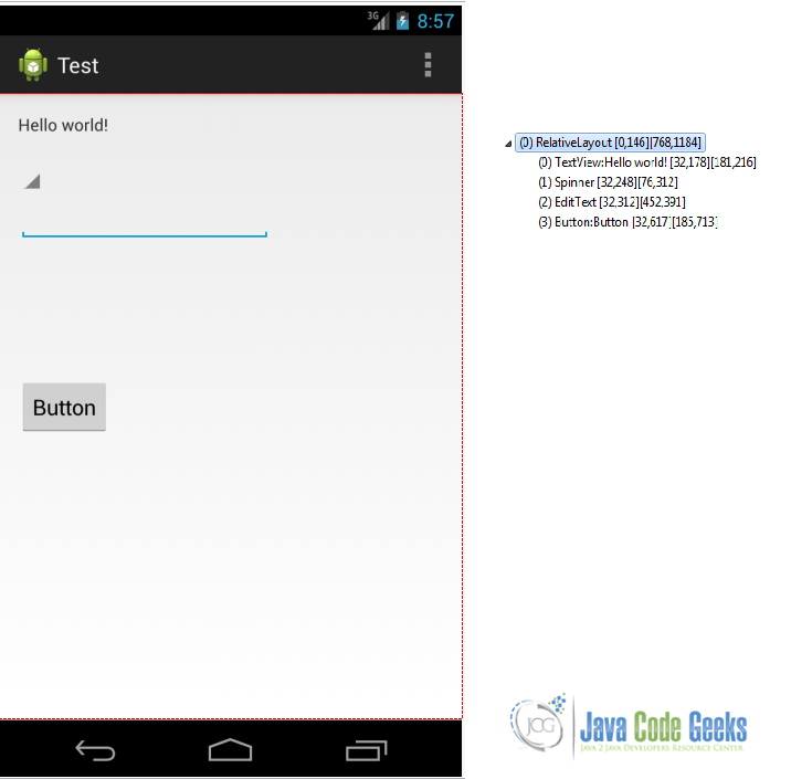
From the example above, we can notice that at the top of the hierarchy there is a ViewGroup (called RelativeLayout) and then there are a list of view child (controls and widgets).
When we want to create an UI in Android we have to create some files in XML format. Android is very powerful from this point of view because we can “describe” our UI interface just in XML format. The OS will then convert it in a real code lines when we compile our app and create the apk. We will cover this topic in a later article where we will describe how we can code a real Android UI using layouts and so on.
4. Multiple devices support
As we know by now, Android is a widely used system by smartphones and tablets. It is installed on many devices and it is a great opportunity for developers because it is possible to reach a wide audience. On the other side, this large number of devices that use Android is a big challenge for every Android developer. To provide a great user experience, we have to take under account that our app can run on variety of devices with different screen resolutions and physical screen sizes.
We have to consider that our app can run on a smartphone or on a tablet and we have to provide the same usability even if the differences in terms of screen resolution and size are big. Our app has to be so flexible that it can adapt its layout and controls depending on the device where it is installed on. Let’s suppose, for example, that we have an app that shows a list of items and when the user clicks on one of them, the app shows the item detail. It is a very common situation; if our app runs on a smartphone we need to have two screens one for the list and one for the details as shown below:
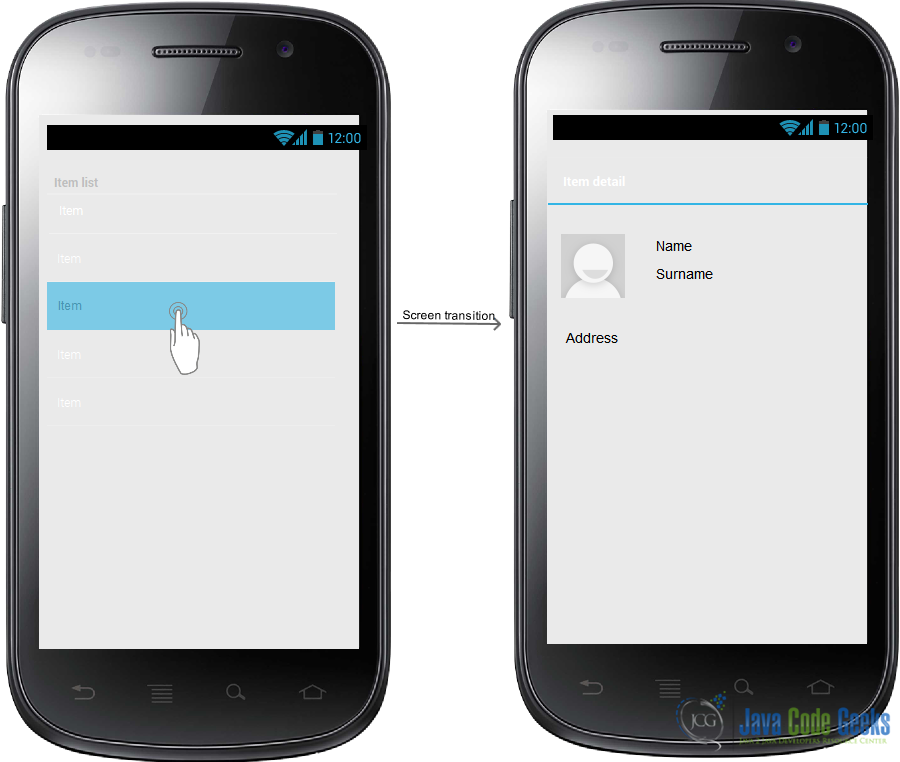
while if our app runs on a tablet, it has to show the details on the same screen:
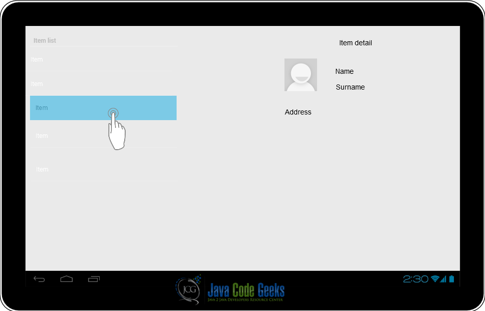
Even if the system tries its best to scale and resize our app so that it works on different screen sizes, we have to make our best effort to ensure that our app supports several screens. This is a big challenge and we can win it if we follow some guidelines.
There are some key concepts we have to understand before coding our app:
- Screen size: It is the physical screen or in other words, the real dimension of our device screen.
- Density: It is the number of pixels in a given area. Usually we consider dot per inch (dpi). This is a measure of the screen quality.
- Orientation: This is how the screen is oriented. It can be landscape or portrait.
- Density independent pixel: This is a new pixel unit measure introduced by Android. It is called dp. One dp is equivalent at one pixel at 160dpi screen. We should use dp unit in our measures when creating UI, at the runtime the system takes care to convert it in real pixel.
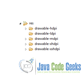
From the screen size point of view, Android groups the devices in four areas,small, normal, large and extra large (xlarge), depending on the actual screen dimension expressed in inches. From the dpi point of view, on the other hand, we can group devices in: ldpi (low dpi), mdpi (medium dpi), hdpi (high dpi), xhdpi (extra high dpi) and lately xxhdpi. This is important when we use drawables (i.e bitmaps), because we have to create several images according to the different screen resolution.
This categorization is reflected in our IDE (i.e. Eclipse or Android Studio), so if we look under the res directory we can find a structure like the one shown below:
The best practices we have to follow are:
- Don’t use fixed dimensions expressed in pixel, instead we should use dp.
- Provide several layout structures for different screen size, we can do it creating several layout files.
- Provide several bitmap with different resolution for different screen resolution. We can consider using 9-Patches-Drawables.
Moreover, Android provides a resource qualifier mechanism that helps us to have more control on how the system select the resource. Usually we can use:
<resource_name>_<qualifier>
where the resource_name can be for example drawable or layout while the qualifier can be hdpi, large and so on. Look here if you want to have more information.
Even if we follow all the best practices to support multiple screen in our app, there might be some situations where they are not enough, especially when we want to support smartphones and tablets. In this case, Android has introduced the Fragment concept. Fragments are available since API 11 and there is a library to maintain the backward compatibility. We will cover these topics in the next articles. Stay tuned!


