Fluent Design Style Toggle Switch For Java, JavaFX
Hi, this time I’m going to talk about the new Toggle Switch style in the new version of JMetro.
Toggle Switch is a control that has become very popular in recent years. I added a JavaFX implementation some time ago to the ControlsFX library.
This new style is available in JMetro version 4.1 that has just been released.
What’s a Toggle Switch
In previous posts I’ve talked about the Toggle Switch control, what it is and a implementation I’ve done and added to ControlsFX library.
In short words, a Toggle Switch is like a Check Box or Toggle Button, with two states (on and off). It typically doesn’t have an indeterminate state like the Check Box can have and in some implementation its text may change when its state changes, to further illustrate the state it’s in.
The ControlsFX implementation has, by default, a look that fits with the default JavaFX Modena theme. Back then, I also added a Metro inspired style to JMetro that you can see below:
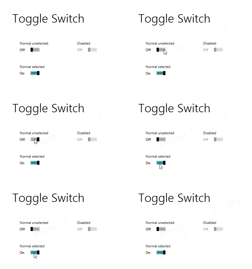
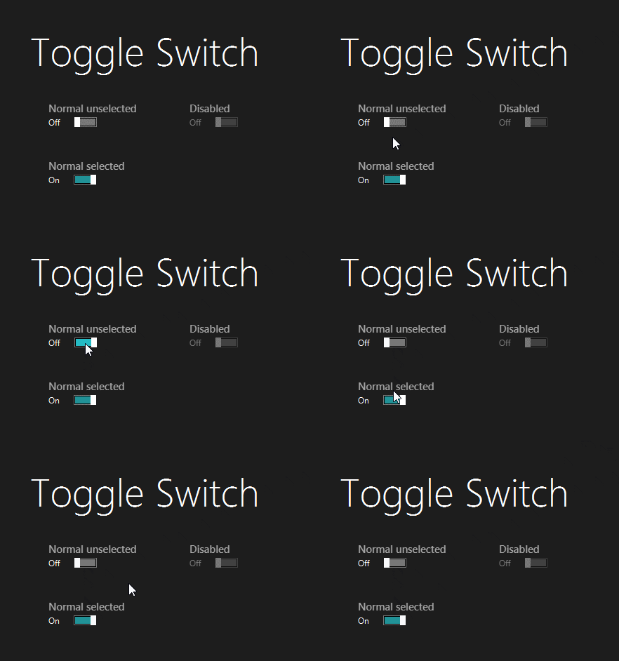
New Toggle Switch style
There were some issues I faced when creating the new JMetro style. First I encountered some bugs in the skin implementation that I fixed in a newly added MetroToggleSwitchSkin.
The JMetro stylesheet has changed to reference this new skin:
1 2 3 | .toggle-switch { -fx-skin: "impl.jfxtras.styles.jmetro8.MetroToggleSwitchSkin";} |
It’s an implementation detail, so you don’t really, ordinarily, have to care about it. The skin is in the impl package to reflect that it’s not public API. If you use it in your code please be advised that things might change in a breaking way in the future.
Another problem I faced is that I now wanted the toggle to be on the left side, and its text on the right. Which is the opposite of the current implementation. For that I added a new CSS property: -toggle-display. which is similar to the Labeled -fx-content-display property.
-toggle-display has three possible values:
left: The toggle is displayed left, and the accompanying text on the rightright: Toggle is displayed to the rightthumb-only: Only the toggle is displayed with no text
The default value is right, which reflects the appearance in my first implementation of Toggle Switch. However, JMetro overrides this and sets it to left, by default:
1 2 3 4 5 | .toggle-switch { -thumb-move-animation-time: 100; -toggle-display: left;} |
Another thing that has changed and you’ll notice in the previous code snippet is the duration of the toggle animation. That is, the time it takes for the toggle dot to go from the left to the right and vice-versa whenever it is turned off or on. This time has changed from 200ms to 100ms as indicated by the -thumb-move-animation-time CSS property.
Without further ado, here’s the new dark and light JMetro style for the Toggle Switch:
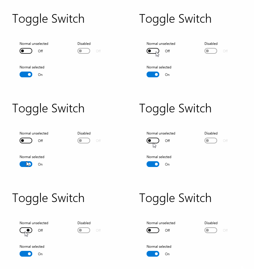
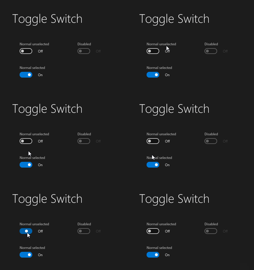
Wrapping up
Version 4.1 of JavaFX theme JMetro is out. This version add a new Toggle Switch style inspired by Fluent Design. The visuals have completely changed, including the animation speed.
A new skin has also been added which adds a new -toggle-display CSS property. Be advised that this skin is in the impl package as it is an implementation detail.
The documentation page for Java, JavaFX theme JMetro will be updated shortly.
As always follow me on twitter and subscribe to this blog.
Here’s what I have planned next:
- New Button style with animation;
- New Slider style;
- New Progress Bar styles;
- Possibility to change colors easily.
| Published on Java Code Geeks with permission by Pedro Duque Vieira, partner at our JCG program. See the original article here: Fluent Design Style Toggle Switch For Java, JavaFX Opinions expressed by Java Code Geeks contributors are their own. |


