Software Development
Charting PagerDuty Incidents over Time (using pandas)
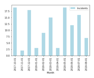
We churn out charts for board meetings to show the health of our system (uptime, etc.). Historically, we did that once per quarter, manually. Recently, I endeavored to create a live dashboard for the same information, starting with production incidents over time. We use PagerDuty to alert on-call staff. Each incident is stored in PagerDuty, which is queryable via the PagerDuty API. From there, it is easy enough to transform that JSON into a matplotlib chart using pandas:
First, we grab the data:
from datetime import datetime, timedelta
import requests

%matplotlib inline

api_url = "https://api.pagerduty.com/incidents"
headers = {
    'Accept': 'application/vnd.pagerduty+json;version=2',
    'Authorization': 'Token token=YOUR_TOKEN'
}


today = datetime.today()
until = today.replace(day=1)

def get_month(since, until):
    current_date = since
    total_incidents = 0
    while current_date < until:
        next_date = current_date + timedelta(days=7)
        if (next_date > until):
            next_date = until
        url = api_url + "?since={}&until={}&time_zone=UTC&limit=100".format(current_date.date(), next_date.date())
        response = requests.get(url, headers=headers)
        incidents = response.json()['incidents']
        total_incidents = total_incidents + len(incidents)
        current_date = next_date
    return total_incidents


# Lookback over twelve months
incidents_per_month = {}
for delta in range(1,12):
    since = (until - timedelta(days=1)).replace(day=1)
    num_incidents = get_month(since, until)
    incidents_per_month[str(since.date())] = num_incidents
    print "{} - {} [{}]".format(since.date(), until.date(), num_incidents)
    until = since
At this point,
incidents_per_month = { 2018-07-01": 13, "2018-08-01":5 ... }From there, it is just a matter of plotting the values using pandas:
import pandas as pd
import numpy as np
import matplotlib
import seaborn as sns

data = pd.DataFrame(incidents_per_month.items(), columns=['Month', 'Incidents'])
data = data.sort_values(by=["Month"], ascending=True)
data.plot(kind='bar', x='Month', y='Incidents', color="lightblue")
And voila, there you have it:
| Published on Java Code Geeks with permission by Brian ONeill, partner at our JCG program. See the original article here: Charting PagerDuty Incidents over Time (using pandas) Opinions expressed by Java Code Geeks contributors are their own. |


how to build java application?
how a build java application