JMetro Version 11.6.5 And 8.6.5 Released
Hello again. Having styled all JavaFX controls in the SDK plus a few more that didn’t exist and some others from other libraries. Subsequent versions will be about tweaking JMetro existing styles or adding some others styles from other controls of third party libraries. That is the case with this release. Here’s what’s new:
- 3 new controls styles;
- tweaks to JMetro existing styles;
Keep on reading for details
New control styles
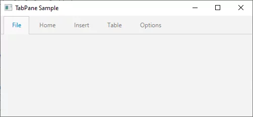
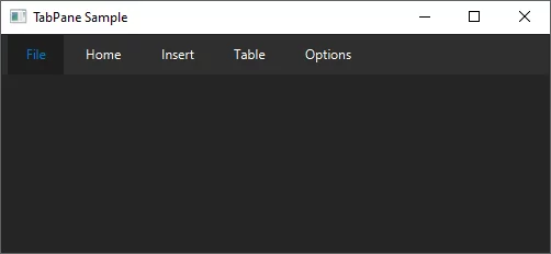
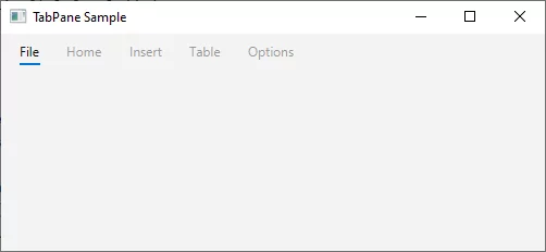
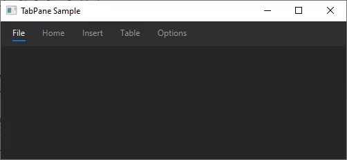
TabPane “with underline”
This is a different style for the TabPane other than the standard existing style. You can either use the existing style or if you add the underlined styleclass to the TabPane you’ll get this new style. Below you can see screen captures of this new style and the default one:
RangeSlider
RangeSlider is a control from ControlsFX.
This control basically is a slider that lets you define a “lower” and “higher” value.
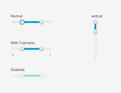
For the JMetro style I needed the RangeSlider thumbs to not be circular. However, there is a bug in the ControlsFX RangeSlider that doesn’t allow the thumbs to be non circular. To fix this JMetro uses a new custom skin for the RangeSlider which is applied by default when JMetro is set.
I’ll be creating a PR for ControlsFX to fix this bug on their Java 8 and Java 11 versions. Hopefully if it gets approved I’ll then remove this JMetro Skin as there will be no need for it.
Below is the RangeSlider with the JMetro style:
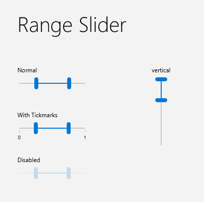
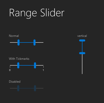
Due to the restrictions imposed by modules, having a custom skin for the RangeSlider in the JMetro Java 11 version is not possible (would require use of classes that aren’t available). This will be solved after the PR to ControlsFX java 11 version gets approved and merged.
Alternating row colors for controls that use cells
An alternating row color style has been added to TreeTableView, TableView, ListView and TreeView.
The purpose of this style is to make these controls data easier to read, which is useful on data heavy TreeTableView, TableView, ListView or TreeView where the width of the rows is large and it can become hard for your eyes to distinguish which cells belong to which rows.
Below is this style for only the TreeTableView:
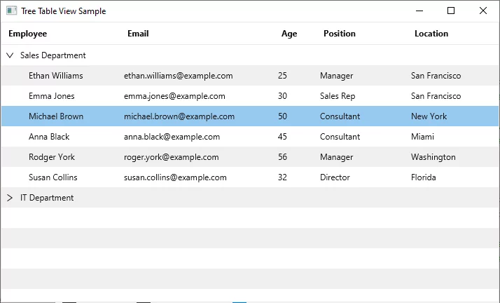
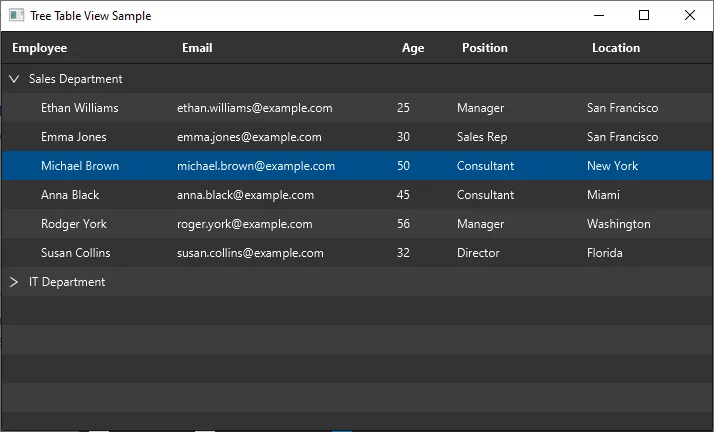
To set this style add the styleclass alternating-row-colors to the control. If that styleclass isn’t present the control will have the normal (without alternating row colors) style.
Tweaks to already existing styles
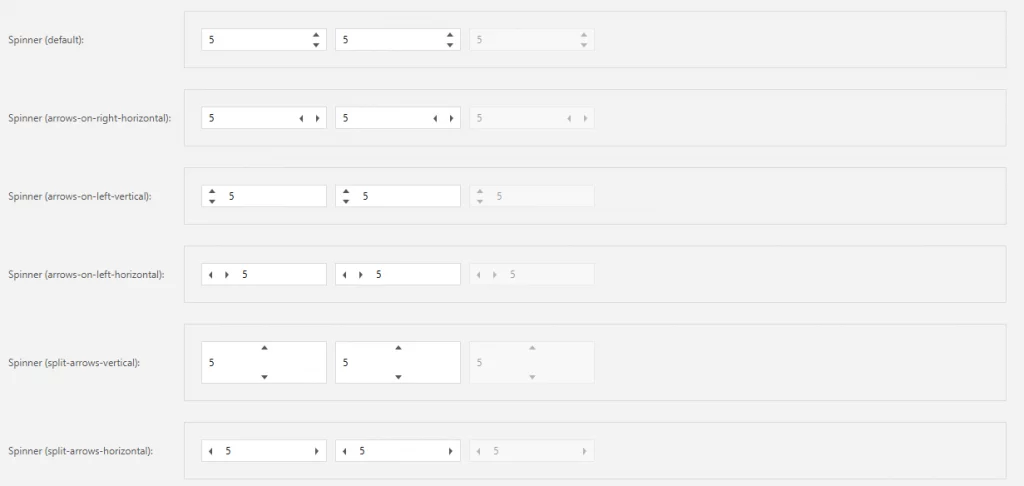
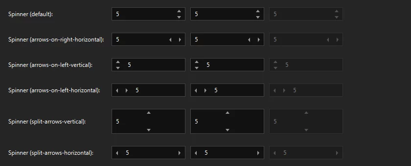
Tweaked Spinner style
The old Spinner style has been tweaked. Here’s the screen captures of the new style:
Other changes
Here’s the full list of the other changes in this release:
- Add style to MenuButton when inside ToolBar;
- Add style for SplitMenuButton inside ToolBar;
- Remove border around MenuButton when it’s inside ToolBar and TooBar hasn’t got focus;
- Missing ToggleButton “light”/toolbar style (we already had Button light style). This has nothing to do with the Light theme. It is a kind of style that both exists in Dark and Light theme which has fewer decorations and, as such, looks more “integrated” with its container (less prominent);
- Change default Light theme background to a greyish tone. Creating a sense of a hierarchy and less tiring to the eyes than having applications look all white by default.
Published on Java Code Geeks with permission by Pedro Duque Vieira, partner at our JCG program. See the original article here: JMetro Version 11.6.5 And 8.6.5 Released Opinions expressed by Java Code Geeks contributors are their own. |


