ReactJS Checkboxes Example
In this article we take a look at using checkboxes in a ReactJS Application. ReactJS has become the go to library for front-end development. It has grown from strength to strength and has won over support from the community of developers. A great ecosystem of libraries and components to support and speed up ReactJS development has sprung up. We look to create a reusable component of our own in this example. The concepts shown here can be used as is in the development of other required components in your ReactJS applications.
So without further ado let us get started with our example.
We start off with a list of tools and technologies used in this example. And ending with a ReactJS example describing the concepts of creating a reusable component.
1. Tools and Technologies
The create-react-app package from the folks at Facebook allows us to quickly generate a ReactJS application structure. It pulls down the latest version of ReactJS as well. Visual Studio Code IDE is my editor of choice for JavaScript development. Although you are free to follow along in an editor of your choice.
2. Project Structure
We use the create-react-app package as follows to generate our ReactJS application
1 | >npx create-react-app my-app |
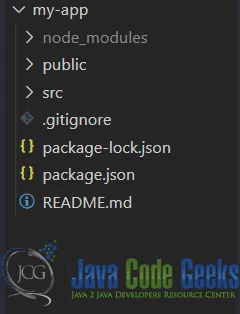
The npx command downloads a temporary copy of create-react-app and runs it with the parameters provided. It disposes of the create-react-app package once done. Once the command completes our new project should look like below:

3. Checkbox Component
Let us create a component, Checkbox, that will render an input tag of type checkbox. We will use this component in different modes as a Controlled as well as Uncontrolled Component. This component resides in a file called Checkbox under the Components folder. And the code for this component looks like below:
Checkbox.js
01 02 03 04 05 06 07 08 09 10 11 | import React from 'react';function Checkbox(props) { const { left, right, text } = props; return <div style={{ display: 'flex' }}> {left && <label>{text}</label>} <input type="checkbox" {...props} /> {right && <label>{text}</label>} </div>;}export default Checkbox; |
Now let us use this component in another component called MyComponent. The code for MyComponent looks like below:
MyComponent.js
01 02 03 04 05 06 07 08 09 10 11 12 13 14 15 16 17 18 19 20 21 22 23 24 25 26 | import React, { useState } from "react";import Checkbox from './Checkbox';function MyComponent(props) { const [checked, setChecked] = useState(false); const handleChecked = ({ target }) => { setChecked(target.checked); } return <div style={{ display: 'flex', flexDirection: 'column', height: '100vh', width: '100vw', justifyContent: 'center', alignItems: 'center' }}> <Checkbox right="true" defaultChecked={true} text="Check Me" style={{ marginTop: '5px' }} /> <Checkbox left="true" text="Check Me"style={{ marginTop: '6px' }} /> <Checkbox right="true" text="Check Me"style={{ marginTop: '5px' }} /> <Checkbox left="true" onChange={handleChecked} checked={checked} text="Check Me" style={{ marginTop: '6px' }} /> </div>}export default MyComponent; |
Now let us use this component and to do that we modify the index.js file suitably. The modified index.js file with changes should look like below.
index.js
01 02 03 04 05 06 07 08 09 10 11 12 13 14 15 16 17 | import React from 'react';import ReactDOM from 'react-dom';import './index.css';import Checkbox from "./Components/Checkbox";import * as serviceWorker from './serviceWorker';ReactDOM.render( <React.StrictMode> <MyComponent /> </React.StrictMode>, document.getElementById('root'));// If you want your app to work offline and load faster, you can change// unregister() to register() below. Note this comes with some pitfalls.// Learn more about service workers: https://bit.ly/CRA-PWAserviceWorker.unregister(); |
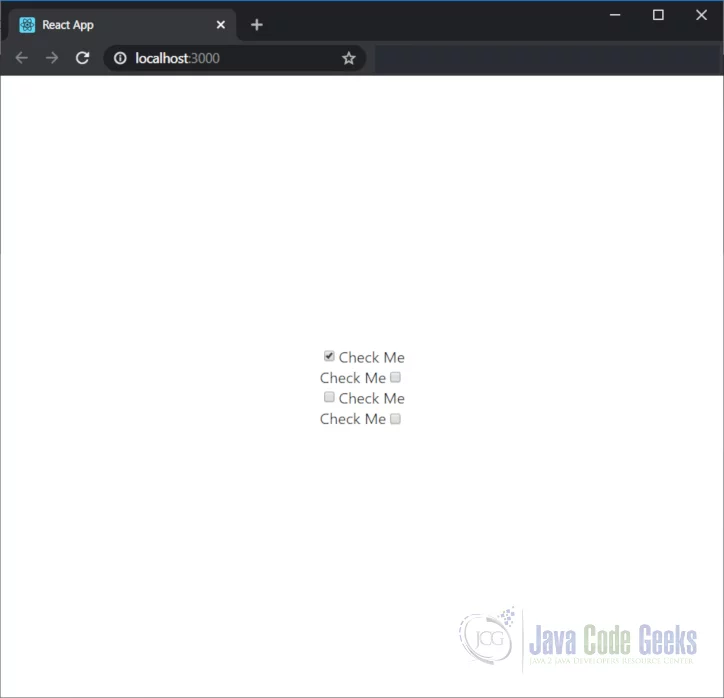
As you can see from the above we have reused our Checkbox component twice as an uncontrolled component. Once we show the label to the left of it and once to the right. Apart from setting other props on the component like style.
We have also set a default value for one these components by adding defaultChecked props like below:
1 2 | <Checkbox right="true" defaultChecked={true} text="Check Me"style={{ marginTop: '5px' }} /> |
We have also made them controlled components, using an onChange handler and binding the checked attribute to state property.
4. Running the application
Let us run our code to see all of this in action. We run the below command to launch our application:
1 | /my-app>npm start |
The UI of our application should look like below:

5. Download the Source Code
You can download the full source code of this example here: ReactJS Checkboxes Example


