ReactJS DatePicker Example
In this example we will take a look at some of the options to display a DatePicker in our ReactJS application. ReactJS has seen explosive growth in popularity and a healthy ecosystem has come up around it. These libraries not only help speed up development but also provide a lot of options off the shelf when building complex UIs. Although here we will build a widget or rather a UI Component ourselves. In this example we will take a look at building a DatePicker Component.
So without further ado let us begin building our example. But first I will list out the tools and technologies used in this Example.
1. Tools and Technologies
I have used the below set of tools and technologies while working on this example. Some of them can be switched out for your favorites.
The create-react-app npm package from the folks at Facebook allows us to generate the skeletal of a ReactJS Application. We use it here to generate the starting point of our example. It uses and pulls down the latest version of ReactJS. Visual Studio Code is my favorite IDE for JavaScript development although you are free to follow along in an IDE of your choice.
2. Application Structure
Let us generate our application structure by running the below command.
>npx create-react-app my-app
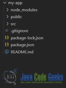
npx tool that downloads a temporary copy of create-react-app and executes it with the arguments provided. Once the above command completes, we should have the below application structure ready.

Now that we have a project structure ready let us proceed with our implementation.
3. DatePicker Component
We build a component named DatePicker in a file called DatePicker under a folder named Components. This component, implemented as a function component, renders an input tag. And we pass in the type property to this component that is then assigned within the component to the type property of the input tag.
The input tag supports 3 different types to allow us to display a date/time picker. The types are as follows:
- date
- datetime-local
- time
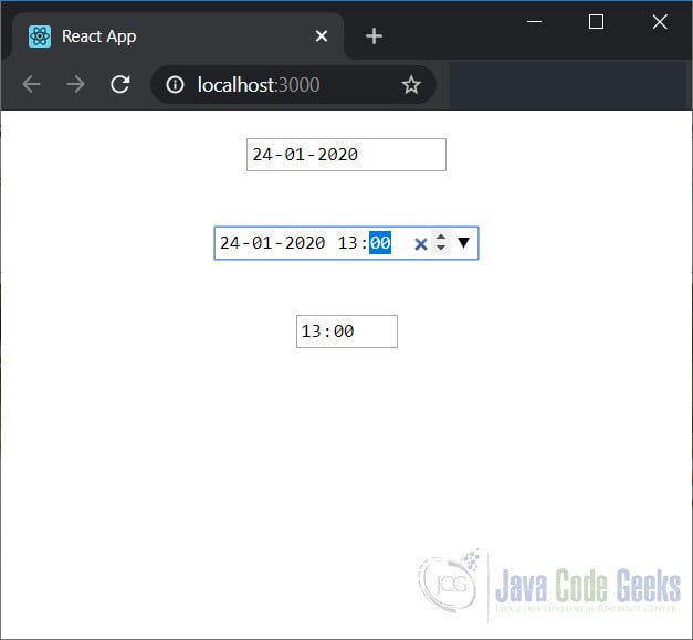
The date type displays a datepicker allowing us to select dates. Whereas datetime-local allows us to additionally pick time as well. The time type presents UI to just pick the time.
The code for our DateTime Component looks like below:
DatePicker.js
import React from 'react';

function DatePicker(props) {
    return <input type={props.type} {...props} />;
}

export default DatePicker;
To use our DatePicker Component we need to modify the index.js file. The code for the modified index.js file looks like below:
index.js
import React from 'react';
import ReactDOM from 'react-dom';
import './index.css';
import DatePicker from './Components/DatePicker';
import * as serviceWorker from './serviceWorker';

ReactDOM.render(
  <React.StrictMode>
    <div style={{
      display: 'flex',
      flexDirection: 'column',
      justifyContent: 'space-around',
      alignItems: 'center',
      height: '50vh',
      width: '100vw'
    }}>
      <DatePicker type="date" />
      <DatePicker type="datetime-local" />
      <DatePicker type="time" />
    </div>
  </React.StrictMode>,
  document.getElementById('root')
);

// If you want your app to work offline and load faster, you can change
// unregister() to register() below. Note this comes with some pitfalls.
// Learn more about service workers: https://bit.ly/CRA-PWA
serviceWorker.unregister();
In the next section we run the application and see it in action.
4. Component in Action
If you are running the downloaded code for this example, you need to run the below command first.
/my-app>npm install
After this we run the below command to run the application.
/my-app>npm start
This should launch our application in the default browser and it will look like below:

This wraps up our look at ReactJS DatePicker example. The code for this example can be found in the next section.
5. Download the Source Code
You can download the full source code of this example here: ReactJS DatePicker Example


