Build Brighter Apps: Using Colour in Android
One of the most effective ways of making your Android app stand out is to add some colour. In this tutorial, I’ll show you how to quickly and easily apply colour to a range of UI elements: backgrounds, text and buttons, and demonstrate how to make working with colours easier by defining them in a designated XML file. In the final section of the tutorial we’ll move onto something more advanced: using a color state list to change the colour of a button whenever it’s pressed.
Getting Started
The quickest way to get started with colour is to leverage one of Android’s predefined colours: black or white. Create a new Android project and delete any default UI
elements and layouts that Eclipse generates. To get us started, we’ll change this project’s background to black:
- Open your XML file in res/layout.
- Add the following, paying particular attention to the “android:background” attribute:
<RelativeLayout xmlns:android="http://schemas.android.com/apk/res/android"
        xmlns:tools="http://schemas.android.com.tools"
        android:background="@color/black"
        android:layout_width="match_parent"
        android:layout_height="match_parent"   >

       </RelativeLayout>
Switch to Eclipse’s graphical layout editor and you will see that the background has changed to black.
Colour Constants
If you want to change the background colour to anything more adventurous than black or white, you’ll need to use colour constants. A list of these constants is available at the official Android docs. At its most basic level, changing the background colour is simply a matter of replacing “@color/black” with one of these codes. For example, the value for ‘blue’ is:
Constant Value: -16776961 ff0000ff
Enter the following to change the background to blue:
android:background="#ff0000ff"
Or, to change the background colour to green enter:
android:background="#ff00ff00"
This is a good starting point, but you’ll have already noticed how time-consuming it is to constantly flit between the Android docs and your Eclipse installation. To save yourself time, you should define all the colours you’ll be using in your project in advance.
Creating a Color.xml File
There are several possible ways to define colour resources, but it’s good practice to keep them together in a dedicated color.xml file in the res/values folder. Eclipse doesn’t generate this file by default, so you’ll need to add it your project first.
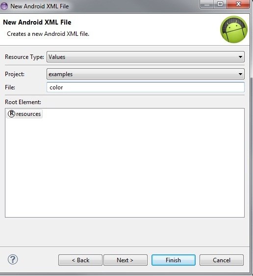
- Right-click on the ‘values’ folder and select ‘New’ from the context menu. If you cannot see an ‘Android XML File’ option you can select ‘Other…’ to bring up a more comprehensive list of options.
- In the subsequent dialog, name your new XML file ‘color’ and select ‘Finish.’

- Success! A color.xml file has been added to the ‘Values’ folder.
Defining Colour Constants
Now we’ve created a colour.xml file to hold our colour values, we’ll define the colour blue so that we can reference it as though it’s a predefined colour.
- Open the color.xml file and switch to the ‘color.xml’ tab if it doesn’t open automatically.
- Enter the following:
<?xml version="1.0" encoding="utf-8"?>

<resources>

<color name="blue">#ff0000ff</color>

</resources>
- Return to your res/layout XML file and set the background colour, in exactly the same way as the predefined ‘black’ we used earlier:
android:background="@color/blue"
- Switch to the graphical layout editor. The background should now be blue.
Defining new colours is now simply a matter of returning to the ‘color.xml’ file and adding another line of XML. Try changing the background colour one last time by defining a new colour:
<color name="LightPink">#FFE4E1</color>
Return to your layout file and replace “@color/blue” with “@color/LightPink.” It’s as easy as that!
Applying Colour to UI Elements
But this exciting new world of colour isn’t just restricted to your app’s background. Once you’ve defined your colours, a single line of XML is all that’s required to change the colour of your text:
<TextView

android:id="@+id/textView1"

android:layout_width="wrap_content"

android:layout_height="wrap_content"

android:layout_alignParentLeft="true"

android:layout_alignParentTop="true"

android:textColor="@color/blue"

android:text="This is blue text" />
You can also change the background colour of a button:
<Button

android:id="@+id/button1"

android:layout_width="wrap_content"

android:layout_height="wrap_content"

android:layout_alignParentLeft="true"

android:layout_alignParentTop="true"

android:background="@color/blue"

android:text="Button" />
Or combine the two to create a button with a blue background and light pink text:
<Button

android:id="@+id/button1"

android:layout_width="wrap_content"

android:layout_height="wrap_content"

android:layout_alignParentLeft="true"

android:layout_alignParentTop="true"
android:background="@color/blue"

android:textColor="@color/LightPink"

android:text="Button" />
Using Android’s Color State List
There are several ways to let a user know you’ve registered their activity within your app, but one of the simplest is to use a ‘color state list’ to change the colour of a UI element. A ‘color state list’ is essentially an object that changes colour to correspond with the changing state of a related View object. In this final part of the tutorial, I’ll show you how to use a color state list in your project, using the example of a button that changes colour as it’s pressed.
1. Define Some Colours
Before we start, you should return to the colors.xml file and add the colours you’ll be using in your app.
<color name="red">#ff00</color>
<color name="green">#f0f0</color>
2. Define a Color State List Resource
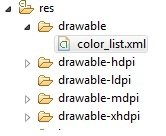
Create a ‘color_list.xml’ file in the res/drawable folder.
An empty color state list uses the following opening and closing XML:
<?xml version="1.0" encoding="utf-8"?>

<selector xmlns:android="http://schemas.android.com/apk/res/android">

</selector>
Each colour in your list is defined using the <item> tag, referring to the colours as a standard drawable resource. You’ll also need to attach each <item> to a state, so choose from the following:
- android:state_pressed=”true/false”
- android:state_focused=”true/false”
- android:state_selected=”true/false”
- android:state_checkable=”true/false”
- android:state_checked=”true/false”
- android:state_enabled=”true/false”
- android:state_window_focused=”true/false”
We’ll create two states, the default state and android:state_pressed. Note that the default value of the item should always be positioned at the bottom of the list, as your Eclipse installation will take the first item in the list that matches the current state. If the first state is the default, Eclipse will never even look at the rest of your states.
<?xml version="1.0" encoding="utf-8"?>

<selector xmlns:android="http://schemas.android.com/apk/res/android">

<item

android:state_pressed="true"

android:drawable="@color/green" />

<item

android:drawable="@color/red" />

</selector>
3. Create Your UI
Now it’s time to put your color state list to work! Open your layout file and create a layout with a single button. In this example, I’m using:
<RelativeLayout xmlns:android="http://schemas.android.com/apk/res/android"

android:layout_width="match_parent"

android:layout_height="match_parent"  >

<Button

android:id="@+id/button1"

style="?android:attr/buttonStyleSmall"

android:layout_width="wrap_content"

android:layout_height="wrap_content"

android:layout_alignParentLeft="true"

android:layout_alignParentTop="true"

android:layout_marginTop="18dp"

android:text="@string/click"  />

</RelativeLayout>
Tip
. Don’t forget to create a string resource for @string/click. Open your strings.xml file and add the following:
<string name="click">Click Me</string>
4. Link It All Up!
Now it’s time to link your Color State List to the button you just created. Reference the list as you would any drawable resource:
<Button

android:id="@+id/button1"

style="?android:attr/buttonStyleSmall"

android:layout_width="wrap_content"

android:layout_height="wrap_content"

android:layout_alignParentLeft="true"

android:layout_alignParentTop="true"

android:layout_marginTop="18dp"

android:text=“@string/click"

android:background=“@drawable/color_list" />
5. Check Your Work
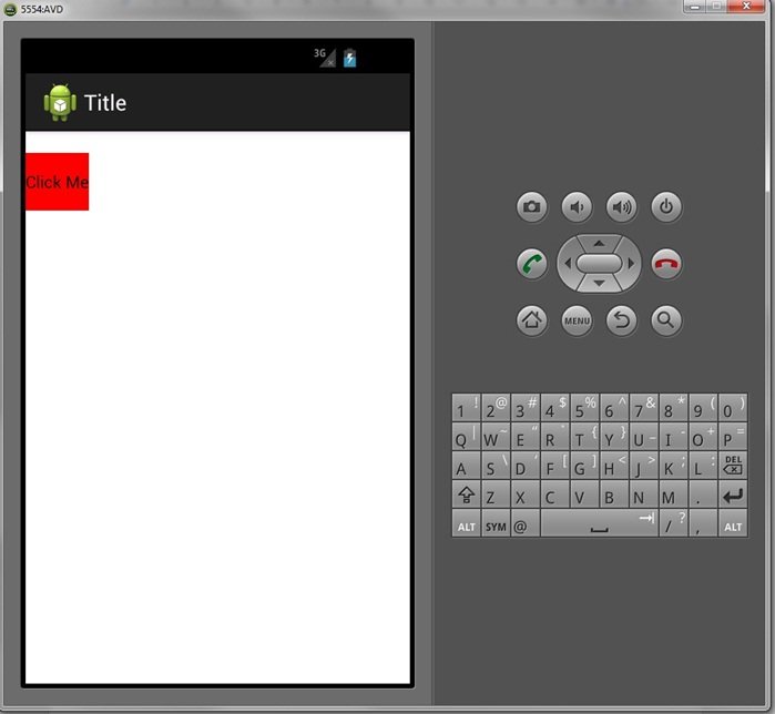
Boot up the Android Emulator and take a look at how this displays.
Now click the button and see what happens.
Try defining additional states and colours in your project, and experimenting with different UI elements such as checkboxes, to really make your Android app stand out from the competition!


