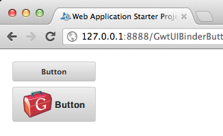
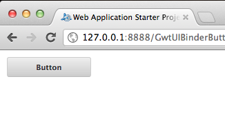
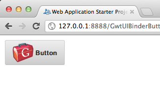
Here’s an example on how to create a custom button using UIBinder on GWT.

01 02 03 04 05 06 07 08 09 10 11 12 13 14 | public class GwtUIBinderButton implements EntryPoint { public void onModuleLoad() { Button button = new Button(); button.setText("Button"); button.addClickHandler(new ClickHandler(){ @Override public void onClick(ClickEvent event) { Window.alert("Button clicked"); } }); RootPanel.get("container").add(button); }} |
01 02 03 04 05 06 07 08 09 10 11 12 13 14 15 16 17 18 19 20 21 22 23 24 25 26 27 28 29 30 31 32 33 34 35 36 37 38 39 40 41 42 43 44 45 | public class Button extends Composite implements HasText, HasClickHandlers, ClickHandler{ private static ButtonUiBinder uiBinder = GWT.create(ButtonUiBinder.class); interface ButtonUiBinder extends UiBinder<Widget, Button> { } @UiField(provided=true) FocusPanel pane = new FocusPanel(); @UiField(provided=true) Label label = new Label(); public Button() { pane.addClickHandler(this); initWidget(uiBinder.createAndBindUi(this)); } @Override public HandlerRegistration addClickHandler(ClickHandler handler) { return addHandler(handler, ClickEvent.getType()); } @Override public void onClick(ClickEvent event) { this.fireEvent(event); } @Override public String getText() { return label.getText(); } @Override public void setText(String text) { label.setText(text); }} |
01 02 03 04 05 06 07 08 09 10 11 12 13 14 15 16 17 18 19 20 21 22 23 24 25 26 27 28 29 30 31 32 33 34 35 36 37 38 39 40 41 42 43 44 45 46 47 48 49 50 51 52 53 54 55 | <ui:UiBinder xmlns:ui="urn:ui:com.google.gwt.uibinder" xmlns:g="urn:import:com.google.gwt.user.client.ui"> <ui:style> .button{ background-color: #eeeeee; background-image: -webkit-gradient(linear, left top, left bottom, color-stop(0%, #eeeeee), color-stop(100%, #cccccc)); background-image: -webkit-linear-gradient(top, #eeeeee, #cccccc); background-image: -moz-linear-gradient(top, #eeeeee, #cccccc); background-image: -ms-linear-gradient(top, #eeeeee, #cccccc); background-image: -o-linear-gradient(top, #eeeeee, #cccccc); background-image: linear-gradient(top, #eeeeee, #cccccc); border: 1px solid #ccc; border-bottom: 1px solid #bbb; -webkit-border-radius: 3px; -moz-border-radius: 3px; -ms-border-radius: 3px; -o-border-radius: 3px; border-radius: 3px; color: #333; font: bold 11px "Lucida Grande", "Lucida Sans Unicode", "Lucida Sans", Geneva, Verdana, sans-serif; line-height: 1; padding: 0px 0; text-align: center; text-shadow: 0 1px 0 #eee; width: 120px; } .button:hover{ background-color: #dddddd; background-image: -webkit-gradient(linear, left top, left bottom, color-stop(0%, #dddddd), color-stop(100%, #bbbbbb)); background-image: -webkit-linear-gradient(top, #dddddd, #bbbbbb); background-image: -moz-linear-gradient(top, #dddddd, #bbbbbb); background-image: -ms-linear-gradient(top, #dddddd, #bbbbbb); background-image: -o-linear-gradient(top, #dddddd, #bbbbbb); background-image: linear-gradient(top, #dddddd, #bbbbbb); border: 1px solid #bbb; border-bottom: 1px solid #999; cursor: pointer; text-shadow: 0 1px 0 #ddd; } .button:active{ border: 1px solid #aaa; border-bottom: 1px solid #888; -webkit-box-shadow: inset 0 0 5px 2px #aaaaaa, 0 1px 0 0 #eeeeee; -moz-box-shadow: inset 0 0 5px 2px #aaaaaa, 0 1px 0 0 #eeeeee; box-shadow: inset 0 0 5px 2px #aaaaaa, 0 1px 0 0 #eeeeee; } .pane{ text-align: center; } </ui:style> <g:SimplePanel ui:field="pane" styleName="{style.button}"> <g:Label ui:field="label"></g:Label> </g:SimplePanel></ui:UiBinder> |
Adding an Image:
01 02 03 04 05 06 07 08 09 10 11 12 13 14 | <g:SimplePanel ui:field="pane" styleName="{style.button}"> <g:HTMLPanel> <table align="center"> <tr> <td> <g:Image styleName="{style.pane}" url="gwt-logo-42x42.png"></g:Image> </td> <td> <g:Label ui:field="label"></g:Label> </td> </tr> </table> </g:HTMLPanel> </g:SimplePanel> |
Reference: GWT Custom Button using UIBinder from our JCG partner Mark Andro Silva at the GlyphSoft blog.
Do you want to know how to develop your skillset to become a Java Rockstar?
Subscribe to our newsletter to start Rocking right now!
To get you started we give you our best selling eBooks for FREE!
1. JPA Mini Book
2. JVM Troubleshooting Guide
3. JUnit Tutorial for Unit Testing
4. Java Annotations Tutorial
5. Java Interview Questions
6. Spring Interview Questions
7. Android UI Design
and many more ....
I agree to the Terms and Privacy Policy
